A satellite image contains millions of colors. A box of crayons contains 120. The mapping from one to the other — quantization — destroys information that cannot be recovered. But what survives is not random. Structure persists: coastlines, vegetation boundaries, the gradient from shallow water to deep. This essay traces the mathematics of that persistence, from the pixel grid to Shannon entropy, from the geometry of human color perception to the information-theoretic limits of codebook design.
Origin
A numbered grid, a box of 120 crayons, and a room full of people filling in one square at a time, watching a satellite image materialize from the numbers.
Color-a-Pixel began at the Institute for Global Environmental Strategies as a way to make satellite remote sensing tangible at public outreach events. Take a satellite image, reduce it to a grid of numbered squares, let participants fill in each square with the corresponding Crayola crayon. The first version was a rapid Python/Streamlit prototype: it accepted an image, downsampled to 72×48 pixels, mapped each pixel to the nearest color in the 120-count Crayola box using a KD-tree in RGB space, and generated a printable PDF poster. It worked well enough to be featured in a NASA Earth Science education story and field-tested at educator workshops across the country.
But the prototype left questions on the table. RGB color matching is perceptually inaccurate. The image enhancement was hand-tuned, not derived from the palette's geometry. And the quantization itself was invisible: you uploaded an image, you got a grid, and the mathematics in between were hidden.
This version is the investigation the prototype didn't have time for. Color matching now operates in CIELAB perceptual color space, where distance corresponds to perceived difference rather than sensor arithmetic. Enhancement is palette-aware, stretching the image's color distribution in three-dimensional CIELAB space to maximize the number of distinct crayons used. A 3D visualization lets you see the image's colors as points in perceptual space, watch them snap to their nearest crayon landmarks, and explore the geometry of information loss through mapping lines, reach territories, and cross-linked brushing between the spatial image, the color histogram, and the three-dimensional color space.
The printable PDF output remains (72x48 half-inch grid cells, fully enhanced CIELAB palette matching, selectable pack size). This is still a tool for making outreach posters. It is also now a lens for seeing what quantization does, and what survives it.
The Grid
Every image on every screen you have ever seen is a grid of colored squares. Each square is a pixel — a single dot of color. Make the squares small enough and your eye stops seeing the grid and starts seeing a picture. Make them large enough and the illusion breaks: you see the mosaic for what it is.
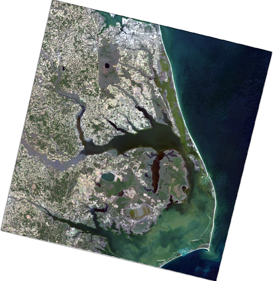
Color-a-Pixel makes the grid visible. A satellite image of the Outer Banks of North Carolina is reduced to 72 squares across and 48 squares tall: 3,456 pixels. Each pixel gets a number. Each number maps to a crayon. The result is a poster-sized coloring activity that can be filled in collaboratively, one square at a time, until the image re-emerges from the numbers.
But the simplicity of the activity conceals real depth. The process of turning a photograph into a numbered grid — of compressing millions of colors into 120, of discarding spatial detail until only the essential structure remains — is the same process that underpins digital imaging, data compression, and remote sensing. The crayon box is a lens.
Resolution
Push the resolution to 144 and watch the image sharpen. Drop it to 24 and watch structure dissolve. At 144 pixels wide, you can make out individual farm fields and the curve of the coastline. At 24 pixels wide, the image becomes an abstraction: land, water, shore, reduced to colored blocks.
This is spatial resolution: the smallest feature an image can distinguish. A single pixel in the Color-a-Pixel grid might represent half an inch on the poster, but it represents a much larger area on the ground. The Landsat satellite that captured this type of image orbits 705 kilometers above the Earth, and each of its pixels covers a 30-meter square of surface. An entire neighborhood can vanish inside one pixel.
This is not a limitation unique to the activity. It is the fundamental constraint of all imaging systems. A camera, a telescope, a medical scanner: each has a resolution limit below which features merge and disappear. The question is never "can we see everything?" but "what survives at this resolution?"
Color as Number
A digital camera does not see color. It counts photons. Behind the lens, a sensor array records how much light strikes each element during an exposure. Color emerges from a trick: red, green, and blue filters over each detector, so each responds to only one band of the visible spectrum. Software interpolates the missing two-thirds for each pixel, producing three numbers, each ranging from 0 to 255. This is the RGB color model.
Those three numbers define a point in a three-dimensional space. Red is one axis, green another, blue the third. Every possible screen color lives somewhere in this cube, from black at the origin (0, 0, 0) to white at the far corner (255, 255, 255): 16,777,216 possible colors. Toggle the 3D visualization to "RGB" mode and you can see this cube, the image's pixels scattered through it.
But RGB is an engineering convenience, not a description of how humans see. Two colors that are numerically close in RGB may look quite different to a human observer, and two colors that look nearly identical may be far apart in the RGB cube. This mismatch becomes a problem the moment you try to find the "nearest" color in a crayon box.
The Quantization Problem
In the 3D view, toggle the mapping lines. A dozen pixel spheres, oceanic blues barely distinguishable from one another, all converge on a single crayon cube. The dozen become one.
Quantization is the act of replacing a continuous range with a finite set of values. When you round 3.7 to 4, you quantize. When you describe a sunset as "orange," you quantize the continuous spectrum of scattered light into a single word. The loss is inherent: every quantization destroys information that cannot be recovered.
Color-a-Pixel performs vector quantization: each pixel's color, a point in three-dimensional space, must be mapped to the nearest point in a predefined set of 120 colors. The Crayola palette is the codebook. The mapping is irreversible. Once a dark teal pixel has been assigned to "Pine Green," the original teal is gone.
The quality of a vector quantization depends on two things: the quality of the codebook (how well the 120 colors span the range of possible inputs) and the quality of the distance metric (how "nearest" is defined). Get either one wrong and the quantized image is not just lower-fidelity but qualitatively distorted: smooth gradients collapsing into abrupt steps because the codebook doesn't have enough entries in that region of color space.
What 'Nearest' Means
Switch the matching metric from RGB to CIELAB and watch some pixels change crayons. The colors that swap are the ones where the two distance definitions disagree, where "closest" depends on whether you ask the sensor or the eye.
The naive approach, finding the crayon whose RGB values are closest to the pixel's, fails because RGB is perceptually nonuniform. Human vision is most sensitive to differences in the green-yellow part of the spectrum and less sensitive at the extremes. Equal numerical steps in RGB do not produce equal perceptual steps. A change of 10 units in the green channel is generally more visible than the same change in blue. RGB treats all three channels as equivalent. Our eyes do not.
In 1976, the Commission Internationale de l'Eclairage defined CIELAB, a color space designed to be perceptually uniform: Euclidean distance between two points approximates the perceptual difference a human observer would report. The three axes are L* (lightness), a* (green to red), and b* (blue to yellow). Switch the 3D visualization to CIELAB mode and compare it to RGB. Colors that were clumped together in the RGB cube spread apart; colors that were distant move closer. The geometry of the space reshapes to match the geometry of perception. When Color-a-Pixel searches for the nearest crayon in CIELAB space, "nearest" means "most similar to the human eye."
The metric shown as "avg Delta-E" in the stats overlay is the mean CIELAB distance across all pixels: a direct measure of how much perceptual color error the quantization introduces. But CIELAB is not perfectly uniform. In certain regions, particularly saturated blues and desaturated yellows, the nearest crayon by CIELAB distance can look wrong to a careful observer despite being the mathematically optimal match. More refined metrics like CIEDE2000 correct for some of these distortions. This tool uses CIELAB because the improvement over RGB is meaningful and the remaining imperfections are themselves instructive: they show where the model of human vision is still approximate.
Reading the Color Space
Reference material: how to read the 3D visualization, what each toggle shows, and how the views are linked.
The 3D view arranges the same data as the 2D image by color rather than by location. Every pixel becomes a sphere placed according to its color; similar colors cluster, dissimilar colors separate. The cloud's shape reveals the image's color structure.
The cubes are the 120 Crayola colors at fixed positions. Bright cubes are colors the image uses; dark, translucent cubes are available but unused. Lines connect each pixel to its assigned crayon: short lines mean good matches. Reach spheres show how far each crayon had to reach to capture its most distant pixel. Bounds boxes show the shape of each crayon's territory; an elongated box means the crayon captures a wide range along one dimension. The color bar shows which crayons are used and how much of the image each covers, with a quality strip along the bottom edge (green for close matches, red for distant ones). The CIELAB/RGB toggle switches between perceptual and sensor arrangements of the same points. Select a crayon from the color bar — the image highlights where it appears, the 3D view isolates its pixels and mapping lines, and the metrics update to show that single color's fidelity. Click the color bar again to deselect.
The Empirical Codebook
The Crayola 120-color palette was not designed by a mathematician. It was shaped over decades by market research, naming contests, pigment availability, and the practical question of which colors children reach for most often. Colors that prove popular survive; those that overlap too closely with neighbors get retired. The result is a codebook shaped by commercial pressure: entries selected for distinctiveness and nameability, with coverage of perceptual space as a byproduct of that selection.
Shannon's rate-distortion theorem states that for a given number of reconstruction points, there exists a minimum achievable distortion. An information theorist designing 120 colors for satellite imagery would produce a very different set, concentrated in the blues, greens, and browns that dominate Earth observation data. But the Crayola palette has reasonable coverage of earth tones and sky blues, which happen to be where natural color distributions are densest. The histogram reveals the alignment: most used crayons are greens, blues, browns, and grays. The reds, pinks, and purples sit unused, a reminder that the palette was designed for the full range of human experience, and orbital photography lives in a narrow slice of it. Toggle the bounding boxes in the 3D view and the palette's uneven coverage becomes spatial: tight, compact territories where crayons crowd the earth tones, and vast empty gaps where the reds and purples have no image data to claim.
Palette-Aware Enhancement
Toggle ENHANCE and watch the histogram spread. Colors that were collapsed into a few dominant crayons disperse across a wider range. The goal is not aesthetic improvement. The goal is information preservation.
The enhancement operates in CIELAB space, before quantization. It computes the image's color distribution and stretches each axis toward the Crayola palette's coverage. An image dominated by dark ocean blues occupies a tiny corner of color space; the palette's 120 points are scattered across the full volume. By expanding the image's distribution to better overlap the palette, subtle color variations in the original (the difference between shallow turquoise and deep navy, between sunlit marsh and shadowed estuary) map to different crayons rather than the same one.
This is three-dimensional histogram stretching, with the Crayola palette's coverage defining the target distribution. The strength slider controls the tradeoff: at low strength, natural color relationships are preserved; at high strength, palette utilization is maximized at the cost of perceptual fidelity. The optimal point depends on the image and the purpose.
Measuring What Survives
The fidelity reads 82%. The information loss reads 34%. Both describe what the quantization cost, but they measure different things.
Fidelity measures color accuracy, derived from the average Delta-E between each pixel's original color and its assigned crayon. A Delta-E of about 2.3 is a "just noticeable difference," so a fidelity of 90% means each pixel's crayon is noticeably different from its original color but still in the right neighborhood. Most useful as a relative measure for comparing two settings.
Information loss measures the destruction of color variety using Shannon entropy. The original image might contain 800 distinct colors; after quantization, those 800 collapse into 24 crayons, some dominating heavily. The entropy drops. The percentage captures how much variety has been destroyed.
These two metrics can diverge. An image might have high fidelity (every pixel close to its crayon) but high information loss (many different original colors all mapping to the same crayon). This happens when the image's colors cluster in a region where the palette has few entries: the matches are individually good, but the distinctions between them are lost. Toggle "Mapping Lines" to see it directly: many pixel spheres converging on a single cube, each line short, all pointing to the same destination.
Beyond the Visible
The Landsat satellite does not see the world in three colors. Its Operational Land Imager captures nine spectral bands, from deep blue (0.43 μm) through the visible spectrum, past near-infrared (0.87 μm), and into shortwave infrared (2.29 μm), plus two thermal bands: eleven total. Each band records a separate grayscale image of how much light at that wavelength reflects from each 30-meter square of Earth's surface.
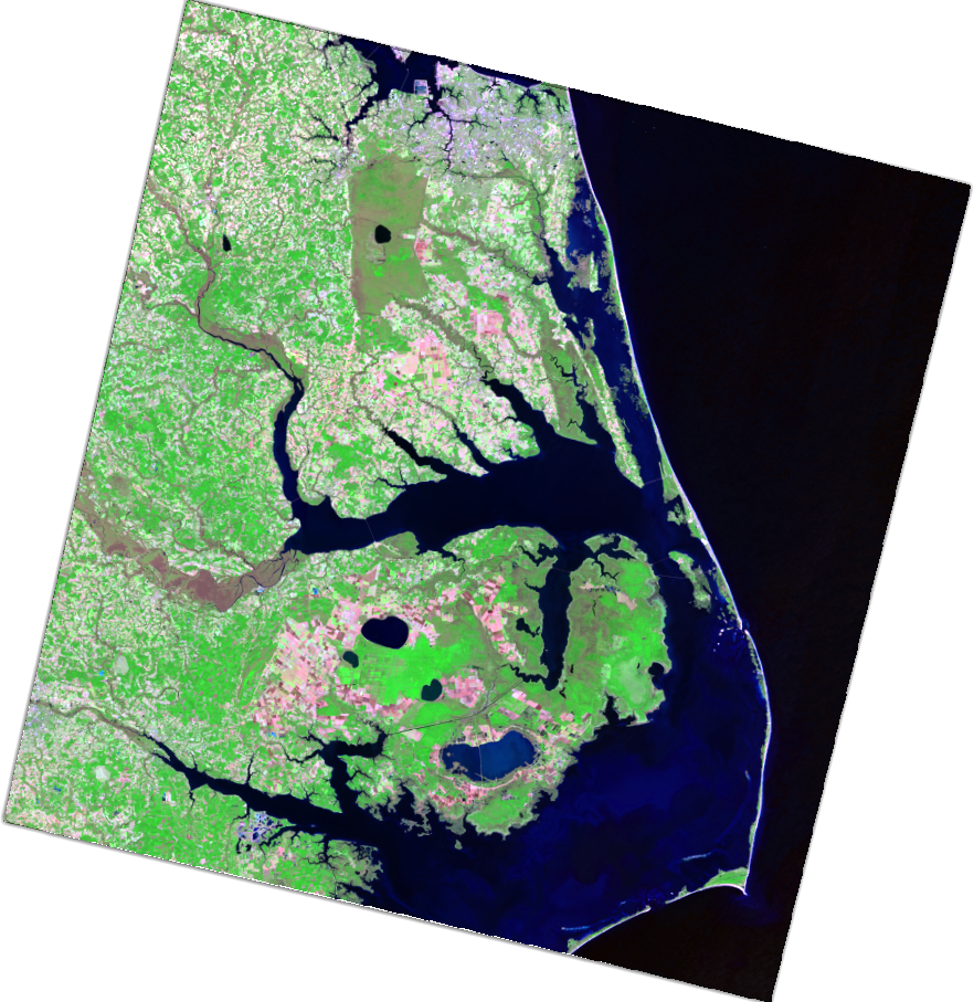
The "true color" image used in this activity is a composite of just three of those bands mapped to RGB. Scientists routinely create false-color composites by mapping different band combinations: shortwave infrared to red, near-infrared to green, green to blue, so that vegetation appears vivid green, bare soil magenta, water dark, and urban areas lavender. Each combination reveals different features.
The full spectral richness of a multispectral sensor is a high-dimensional dataset: each pixel is a point in 11-dimensional spectral space. The compression from eleven bands to three visible colors is itself a quantization, performed before the image ever reaches our tool. The crayons quantize the already-quantized. Every step in the pipeline from photon to poster discards information, and at every step the question recurs: what structure survives?
Hyperspectral Imagination
Hyperspectral sensors divide the spectrum into hundreds of narrow, contiguous channels. Where Landsat sees eleven colors, NASA's AVIRIS sensor sees 224. The resulting data cube contains enough information to identify specific minerals, detect plant stress before it becomes visible, measure water quality, and distinguish between crop species.
The quantization problem scales accordingly. Compressing a hyperspectral pixel from 224 dimensions to 3 for visualization or to 1 for classification requires dimensionality reduction: principal component analysis, spectral unmixing, minimum noise fractions. These are the high-dimensional cousins of the operation performed here. The mathematics differs; PCA finds orthogonal axes of maximum variance, spectral unmixing decomposes mixtures into endmember signatures. But the question is always which structure survives the compression and which is discarded. And the stakes are higher. A misclassified crayon color is a visual approximation. A misclassified mineral signature in a mining survey can have real consequences.
How the Eye Encodes Color
The human visual system encodes color not as three independent cone responses but as three opponent pairs: light versus dark, red versus green, blue versus yellow. You cannot perceive a "reddish green." These pairs are mutually exclusive, processed by single neural channels that signal one extreme or the other. CIELAB's three axes correspond approximately to these three opponent dimensions.
This also explains metamers: two physically different light spectra that produce identical cone responses and therefore identical perceptual colors. In CIELAB space, metamers occupy the same point. The nearest-crayon search treats them identically, which is correct. If a human cannot tell two colors apart, they should map to the same crayon. The quantization respects the limits of the perceiver.
From Crayons to Compression
The Color-a-Pixel pipeline implements, in miniature, the full chain of lossy data compression. A source signal is sampled, transformed, quantized, and encoded. The decoder is a child with crayons, reconstructing an approximation by looking up each index and filling in the corresponding color.
Reveal the full palette in the 3D view and the imbalance is visible: decades of market-driven color selection concentrated entries in vibrant reds, oranges, and yellows — colors children reach for — while the earth tones, foliage greens, and sky blues where satellite imagery is densest are comparatively underrepresented. An information theorist designing a 120-color codebook for orbital photography would pack entries into exactly those blues and greens where Crayola is sparsest. A crayon company, optimizing for nameability and visual distinctiveness, arrived at a different solution: theoretically inefficient for this task, but irresistible to a five-year-old.
That last property matters. The compression is not hidden inside an algorithm. It is spread across a table, visible in every numbered square, argued over by participants who are performing lossy data compression without knowing the term. The information loss is a moment: someone steps back, looks at the emerging poster, and says: I can see the coastline.
Continuity
Color-a-Pixel asks a question that recurs across every project in this portfolio: what happens to deep natural structure when you quantize it?
The helical taijitu quantizes a continuous topology into a binary classification, and finds that the boundary between the two is where all the geometric structure lives. Color-a-Pixel quantizes continuous color into 120 discrete crayons, and finds that the mapping geometry reveals the relationship between human vision and the natural world. Crayola's yellows are dense and differentiated; its blue-greens are sparse, a six-crayon approximation of a perceptual region where human vision makes its finest distinctions. The MPC-1 will quantize continuous biological growth into discrete photogrammetric snapshots, and the sampling rate will determine what developmental processes can be resolved.
In every case, the quantization is the moment where understanding either emerges or is lost. The crayons make it visible. The mathematics make it precise. A student who has mapped the gaps in a crayon palette, who has seen where 120 names fail to cover what the eye can see, will not accept a data resolution on faith again.